
Twyla Tharp and Picasso
Read on Two Coats of Paint.
That a work of art can mean something from generation to generation, that it can continue to reflect not only the time in which it was made but also make us think years later, is what makes it a masterwork. Seldom in the realm of dance, the most ephemeral of art forms, is a work appreciated across disciplines, its worth acknowledged by a broader audience than originally targeted. We are lucky that at any time we can wander into a museum and stand face-to-face with a masterpiece by Picasso, Matisse, or O’Keeffe. We can’t do this with dance. Perhaps as virtual technology continues to expand, we will be able to experience the great dances of our time as if breathing the same air of the performers. Until then, we must wait. It’s been sixteen years since I last saw In the Upper Room by Twyla Tharp.
Original cast of thirteen premiering at the Brooklyn Academy of Music in 1987 included Erzsebet Foldi, Stephanie Foster, Julie Nakagawa, Cathy Oppenheimer, Karen Stasick, Ellen Troy, Shelley Washington, Jamie Bishton, John Carrafa, Richard Colton, Kevin O’Day, Kevin Santee, William Whitener. Photo © Tom Brazil.
Although I studied ballet, I’m no balletomane. I first learned of Tharp’s ballet, which premiered August 28, 1986, not through its performance, but referential through the ballet In a Crowded Room, choreographed in 1993 by my friend Julia K. Gleich.
Clocking in at around 40 minutes, Tharp’s is a terror of a dance that starts with the dial set to ten then turns it north to twelve, thirteen, fourteen… you get it. The duration is equivalent of two grueling back-to-back VO2 Max treadmill tests (as a former professional track athlete, this is the treadmill test requiring an athlete to push themselves to exhaustion to determine their fitness).
Unlike a painting that remains in statis the moment it is complete, a dance is only as good as those performing it. Fortunately, during its recent four-day run at City Center, this dance was exceptionally performed by Tharp’s chosen cast of: Jeanette Delgado, Benjamin Freemantle, Jada German, Kaitlyn Gilliland, Daisy Jacobson, Lloyd Knight, Julian Mackay, Marzia Memoli, Stephanie Petersen, Reed Tankersley, Cassandra Trenary, Daniel Ulbricht, and Richard Villaverde.
The nine-section dance alternates between ballet and modern groups, which pump themselves up to a level of compulsive virtuosity (and undress) culminating in a furious finale. “You have the modern men which Twyla considers like the bass voices in the piece,” explained the dancer Kevin O’Day, who was part of the original cast, “and the modern women, who are like the alto voices. The ballet women are more like sopranos, and the men are like tenors. The movement is ‘voiced’ like that.” There’s some special terminology to go along with the ballet/modern distinction too. “The modern half are called stompers and squatters because the cast wears sneakers. And the ballet half are just called the ballet people,” said O’Day. He further noted:
I think what Twyla is doing in In the Upper Room is that she’s combining all the dance styles that you could grab onto to mold them into a new classic dance style. Even the movement that the modern people do in the piece is very classic. It’s bigger movement – really expansive and really open.
Beyond the peculiarities of genre, Tharp’s standards are simple: execute with precision and commitment. “One thing Twyla hates is a conservative performer,” O’Day said, “That’s her pet peeve. She hates people who hold back. She yells at people. Says it’s boring. Fix it. Change it.”
Tharp recognizes the difference between ballet and modern but believes that dance has a single root. In 2000, she told Charlie Rose:
I have always believed that dance has a root, and that is in the human body. And the human body can move. Anyone isolating any camps saying this belongs here and this belongs here was misguided. The techniques to be learned in the Classical ballet are real and the vocabulary has been developed for over 300 hundred years. The techniques of the so-called modern world are in a way much more recent, but in a way much more ancient because they have been practiced since the beginning of time – in tribal dances and in the beginnings of theater. As long as you know you are going home you can learn a lot from the Egyptians.
In those days, Tharp had been working with Teddy Atlas, a boxer who had trained a young fighter named Mike Tyson. It still shows in the choreography: she once described the piece as “a display of athletic prowess based on endurance, power, speed, and timing.” Indeed, the cast I saw at City Center performed with a bracing air of reckless daring – on the edge of control in the way that Tharp is famous for. The speed of dancers’ movements reminded me of the long-exposure studies of light the photographer Barbara Morgan did in the early 1940s. As they moved on stage, my eye could capture only the traces of their ephemeral gestures, lending the enterprise a preternatural quality.
Tharp often references her childhood growing up on a Quaker farm in Indiana. She saw how the earth worked and understood the ancestry of place. She experienced how an entire community worked as an entity—tasks performed with precision. These elements of her background coalesce in In the Upper Room. High-energy repetitive moves fit with Philip Glass’ relentless score, which in 1987 critic Tobi Tobias – erroneously, in my view – dissed as “harsh” and akin to “a train rushing at great speed, boldly hooting.” Jennifer Tipton’s lighting design exists in a dense fog that makes the dancers appear spontaneously – reportedly the exact effect Tharp wanted. In his book Seventy-nine Short Essay on Design, Michael Bierut described Tipton’s design this way:
In the Upper Room is staged in an even, featureless haze. The dancers are invisible until they are picked out by Tipton’s precise, razor-sharp lighting. It’s a simple effect, familiar to anyone who has driven a car on a foggy night, but in the hands of this brilliant designer, the results are as mesmerizing as anything by James Turrell. As the piece reaches its climax, dancers materialize out of nowhere before your eyes… Tipton’s lighting is the kind of magic that delights you even when you know exactly how the trick works.
Tobias described the costumes, designed by Norma Kamali, as “full wardrobes ranging from glossy pajama outfits in convict stripes to screaming-red skimpies, the women’s accessorized with red pointe shoes over matching socks.” She added that Tharp “still hasn’t overcome the modern dancer’s grudge against classical dance. She’s set up this piece so that her dancers look handsome and confident only when they’re in sneakers.” If she really had it in for ballet, as Tobias suggested, I’m not sure the attitude endured. She told Rose that it had taken her 35 years to “size up against the absolutes” – namely, Martha Graham (whom she studied with) and George Balanchine (whom she never met but revered). I’d argue that she is not a reckless iconoclast, and that her creative genius – her directness, her temperament – could go a few rounds with the likes of Picasso. But we’ll never know because you can’t hang a Tharp alongside Les Demoiselles d’Avignon. Don’t we all agree that Faith Ringgold gave Mr. P a run for his money when MoMA rehung the collection in 2019?
As a sidebar, it’s remarkable how powerful Tharp makes her women. Within duets, in which women typically succumb to the muscling of their male partners, the women are the ones dictating direction. Even when she makes them take a knee, they rise with authority, intent, and drive. It is a pair of women that open and close In the Upper Room, striking a marching pose with hands gripped into fists.
“Every dance directs the next so it’s always about learning,” Tharp said in a 2019 video interview, “It’s how do we launch from where we are to the future.”
The future where I can see the great Tharp “hanging” alongside a great Picasso.
In the Upper Room by Twyla Tharp, Choreography by Twyla Tharp, Music by Philip Glass; featuring Jeanette Delgado, Benjamin Freemantle, Jada German, Kaitlyn Gilliland, Daisy Jacobson, Lloyd Knight, Julian MacKay, Marzia Memoli, Stephanie Petersen, Reed Tankersley, Cassandra Trenary, Daniel Ulbricht, and Richard Villaverde . NY City Center, October 19-23, 2022.
About the author: Jason Andrew is an independent curator and writer based in Cypress Hills, Brooklyn. Follow him on Instagram: @jandrewarts
Frank Owen, trailblazing innovator
Read on Two Coats of Paint.
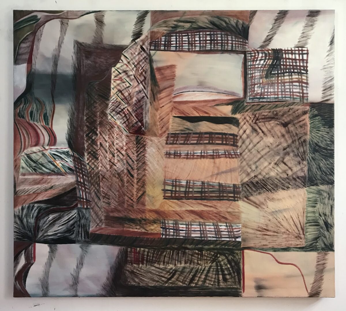
I first came to know the work of Frank Owen over two decades ago through the sculptor Joel Perlman. I stepped off the elevator at Perlman’s studio on West Broadway and immediately encountered an Owen painting. It seemed fitting to discover such a physical painter as Owen through a sculptor. Only recently I learned that the title of that painting was Augmented Position, also fitting insofar as Owen has challenged and changed the way one can experience painting. The proof is in his current show “Retrospection,” on view at Nancy Hoffman Gallery.
Owen’s paintings have always been about expanding the painted field. He arrived in New York City in the 1970s and recalls with wonder living and working in SoHo during that period. He was among the few “painting is dead” deniers and took to redefining painting through process, addressing the picture as a space defined not just by a height and width but also depth. To convey this, he developed and mastered the unique technique of building a painting inside-out or in “verso,” like sculpting via mold making. The process dates back to when artists carved into the surface of clay, poured paint on that surface, then meticulously pulled back the “skin” of the painting, stretching it to canvas. To learn more about Owen’s process, see Alexi Worth’s interview with him from 2020.
Process for Owen was not a means to a preconceived end, nor a response to Richard Serra’s molten throwns or Lynda Benglis pile pours. Instead, Owen was taking a strong position on the act of looking. Just as Mark Di Suvero rescued us from Minimalist sculpture by introducing his thrusting and sprawling dynamic tensions, Owen offered a new way of experiencing painting through what could be called tensile articulation.
With inspired inventiveness, he engineered a way to harness the expressive nature of the medium, capturing it in a surface plane with layered depth. Any number of elements could cohabit there in floating stasis. Paintings thus became scaffoldings of shapes compressed in layers of paint as if preserved like fossils in amber.
When a fire consumed his SoHo loft in the 1980s, Owen headed for the hills of Keene Valley in the Adirondack Mountains. Distilling the lifeforce from nature continues to be the dominant theme in his work.
In Calipers of the King Fisher, composed of linear and arching shapes, Owen captures nature and a new kind of paleo-kinetic vibe. Rough-hewn with layers upon layers of jut and jab, the painting fuses constructed and fluid elements of abstraction with subtle yet stern emotion. Shapes found in the painting were often generated on his wife’s desktop computer, then made into posterboard templates which could be reused.
Three decades later he painted Gala, which consists of multiple sheets of chromatic industrial polyethylene with premanufactured painted elements, collage, and glue. Here Owen relies heavily on an exhaustive combination and recombination of prefabricated modules of visual information.
Embracing the bold and the garish, his recent work is centered on a series he calls the Venetians – paintings that bustle with deep, rich colors, patterns emphasizing surface, and layers playing on the effects of light. On view are over a dozen compelling paintings in evolved from this series, all measuring 50 x 40 inches, different but related. Their juxtaposition is repetitive and coercing on purpose as Owen charged himself in these recent paintings, to draining himself of everything he could think to do with the intention of exhausting the viewer.
Undulating with color and texture. Amplify and Gala, and Southwest and Elements, are paired. Each generates a zany equilibrium and idiosyncratic rhythm. Owen creates swirling spaces with forms, tendrils, fractured grids, and looping lariats. Each has a distinct veil of color with a jagged armature conjuring worlds within worlds that move in art-historical orbits near those established by surrealists like Max Ernst and Roberto Matta.
What Frank Owen achieves is a cascade of suspense without definition. That, I feel, lies at the heart of his poetic disposition. “Retrospection” offers both his mind-blowingly chromatic new paintings and a sampling of his career defining old ones. What is revealed is a trailblazing innovator of non-representational art. His work references and aggregates time itself.
“Frank Owen: Retrospection,” Nancy Hoffman Gallery, 520 West 27th Street, New York, NY. Through September 2, 2022.
About the author: Jason Andrew is an independent curator and writer based in Cypress Hills, Brooklyn. Follow him on Instagram: @jandrewarts

Edith Schloss: Crude Poetry
Edith liked the lively and the slangy way of painting things. “Crude daily poetry,” she called it.

“How can you think of everything when roses smell the most and teapots lean on elephants and a spring is lost.”
— Gertrude Stein in A Sonatina Followed by Another, 1921
Edith liked the lively and the slangy way of painting things. “Crude daily poetry,” she called it.1
For much of her nearly eight-decade career, Edith’s daily poetry took form in painting eclectic junk-shop tchotchkes, which she’d line up on an open window’s ledge. These compositions offer an honest elucidation of time and place, while reflecting her acquaintance with Giorgio Morandi,2 to whom she made a pilgrimage in the summer of 1961, and who advised her that from il reale was the most abstract way to paint. Of these jumble-shop baubles she said:
I look at them and the weather before and try to have clear ideas about it all and the world, and to put it down in the simplest color and line [. . .] Abstract Art? Figurative Art? All art is a fusion of the real outside, and that which is inside us.3
In life Edith was an unsentimental romantic, a disposition likely formed through the years of struggle, dismissal, and rejection experienced by every mid-century woman artist. Her recently published and celebrated memoir, The Loft Generation (2021), confirms that Edith was intrinsically linked to the milieu of postwar American art. She arrived in New York City in 1942 at age 23, having already mastered several languages while living in two of Europe’s great art cities, first Florence and then London. “Coming from Europe, I believed in abstraction,” she wrote regarding her early days in New York City. And she was “hungry for more.”4
Soon she met the painter Willem de Kooning, passed her citizen exam with the help of the poet and critic Edwin Denby, and married the photographer and painter Rudy Burckhardt. She “happily absorbed” the downtown scene and “settled down to paint for painting.”5 In the 1958 canvas titled Family Album, Alex Katz captures the ménage that was Edwin Denby, Rudy Burckhardt, and Edith Schloss, with little Jacob in the middle.
My mistake, ‘aided’ by Rudy and Edwin, was never to take a grandstand. But nestle in my little self-world, enjoying its coziness and sometimes cold thought—but no pushing to go out and hold it up for everyone—the macho world of The Club, beautifully unique, but a what the fuck man’s land. Us ‘girls’ [were] very well liked but kept somehow from imagining ourselves serious competitors.6
Even in those early years, Edith gravitated towards “the sweep and touch of a quick hand and the catch of a clear eye.”7 But overall her sensitivity to art swung to the side of the primordial, the rough, and the raw. She gravitated to the stories painted on cave walls and glazed on Greek vases, “the before-Renaissance pink and gold Holy stories, the clumsy Romanesque sculptors, the Pisanis, the wedding chests in Florence, Goya, the early German expressionists, [Hieronymus] Bosch and [Heinrich] Zille, and Krazy Kat.”8
The convincing free hand of Henri Matisse was also an influence. Once on a trip to Provence, she visited the Musée Matisse and the Chapelle du Rosaire de Vence. “I saw how all his life he learnt to unlearn while making things clearer to himself,” she said.
His depth, simplicity, and faith were also so close to that of the Sienese painters. There is something like this in folk art and in children’s painting which are quite direct and from the way back. All these have become an example.9
In 1962, precipitated by a tangled separation from Rudy, Edith fled to Rome with Jacob in tow. Expecting to stay on only a few months, she remained a lifetime. There her second migration began. There the fresh-air views from bright open windows high above the wretchedness and wonder of humanity would shape her “self-world.”
Life in Rome was lonely, but living among the ancients made her feel like a “lady in a fool’s paradise.”10 In a letter to her close friend, the painter and poet Helen DeMott, she wrote that she had gone fishing and caught two fish. These she painted before she ate them. “I think my style is changing,” she wrote, “sort of looser, lazier.”11
The painter Jack Tworkov was among the first of many prominent New Yorkers to visit Edith in Rome. He took her to the National Etruscan Museum, had lunch, then praised her new pictures. She wrote DeMott, “If I didn’t mind, he thought I was a female Soutine.”12 High praise, indeed, for Tworkov’s essay on Chaim Soutine, published in Art News in 1950, has been singled out among his many writings as one of the earliest attempts to characterize the emerging expressionism of the New York painters.13
In 1963, she at last managed to find a place of her own. Writing to her close confidante, the artist and activist Lucia Vernarelli, she celebrates the petit plaisirs of her newly found apartment on via della Vetrina:
Listening to South American music on the radio. The radio reminds me of Prue Devons, my shelves and things on them, of 21st Street. Jacob’s whistling in the background makes it very jolly. Having an apartment of our own for the first time, painted white and with things all our own, cooking in the cunning little kitchen all the time. It’s like our old life in Chelsea [. . .] Only you can understand thoroughly what it is not to have one’s own nest, and so you know how I really feel quite alive for the first time since leaving 21st Street, well not alive, but homey [...] Before me is a bunch of wildflowers we picked in Veio.14
Though the apartment was a “mildewy mess,” had no running water at first and rain flooded it twice, Edith describes feeling “truly vetrinaceous” [sic] with the wash fluttering outside her front windows. Every Sunday she went to the Porta Portese flea market telling herself firmly “no more broken things,” only to come home with another piece of exquisite junk which she would make functional or place meticulously on the shelves she had salvaged from the street.
Steady and determined, it wasn’t long before she was exhibiting in Rome. In March of 1964, she showed her assemblages at the Aleph Gallery on via Zanardelli. The Rome Daily American dubbed it the most entertaining show in the city.
Edith painted most during the summers, first in Liguria in the village of La Serra di Lerici, which overlooks the Bay of La Spezia. Part of the Northern Tyrrhenian Sea, it was also known as The Gulf of Poets. The English writers Mary Shelley and Percy Bysshe Shelley as well as Lord Byron were among the many drawn to its dark blue waters, warm beaches, and soothing nature. It was where Shelley drowned. Rackstraw Downes had put her on to Edward Trelawney’s Last Days of Shelly and Byron (1858) when they met in the fall of 1974. “The whole topic was new to Edith,” he later wrote, “as an expat herself, and a fan of the area, she was fascinated.”15
The irony of tragedy striking such a beautiful place was not lost on Edith. In fact, it added to the balance she drew from the place—a quiet steadiness in her still lifes of homespun objects “lined up against the pageant of the sea.”16
Sitting rather conspicuously on the horizon in the Bay of La Spezia is the little lopsided island of Tino and its San Venerio Lighthouse. Edith made them her muse, and their profili became a recurrent theme in her paintings during this time and for years to come. Alone and at sea, this battered and weathered island could be a stand-in for a self-portrait—casting herself as the main character in a story illuminated by a rising pink moon or a sinking red sun. “We are all sometimes homesick for a past that may never have happened,” she wrote, “so I imagine I have come from the Mediterranean and have returned to it.”17
One summer in particular, Edith accompanied her new lover, the composer Alvin Curran, to Florence where he had a gig playing Dixieland Jazz at the Red Garter Nightclub. From her room along the via di Rignalla, she arranged whatever objects she managed to carry in her luggage from Rome, along with chic bric-à-brac she found around town, and painted a series of still lifes.
These paintings became more than just mementos of her sojourns. They establish what could be called her mature style. Rignalla (1967) and Hot Cross Buns (1967) are bright and honeybee sweet. They belong to a series of colorful lineups of flowers, tightly cropped within the frame so that the nestled still life pushes into the foreground—no hint of a horizon. At last, the off-kilter of Van Gogh’s Portrait of Dr. Gachet (1890) in Frankfurt that had so impressed her as a student for its “funny little equal strokes going to the corner like rain on a tilted plane”18 had made it through to her own paintings, which would forever after squiggle and sway.
Consider Spring Green (1967), in which a thickly painted butterfly wavers over a stacked set of vases full of spinning flowers, or Summer (1968) and The Day of the Hedgehog (1968), which mark the first of many annual returns to the Bay of La Spezia—the latter an ode to Italy’s 12th-century Riccio de’ Ricci’s weather forecasting erinaceidae.
As an introduction to her solo exhibition at Galleria Il Segno, Rome, in 1968, the avant-garde Florentine conceptual artist and experimental musician Giuseppe Chiari recognized the thoughtfulness in her paintings, offering that they were made of “kindness.”
It simply means that Edith Schloss has always put the stimuli that came from her own sensitivity before her—but I could also say the reaction of her, because one must not be afraid of this word— to stimuli filled with her own ideas. It is humble painting.19
Vanitas is an unavoidable theme in Edith’s art. Not that she respected its stodgy connection to tradition or that she was obsessed with the symbolic representation of decay or death; her treatment of it more likely
alludes to her sense of transitoriness—the brevity of the moment and the ephemeral nature of life. Edith learned for herself early on that for an object to be worth painting, it had to have character, it had to belong to someone. From her memoir we learn how she came to appreciate still-life painting:
At the Art Students League there was a so-called still-life closet, full of dusty vases, compotes, Chianti bottles, candles, mandolins, and lots of drapes. When we pulled out some of these objects, I could do nothing with them, nothing had any character, they did not belong to anyone. ‘Phooey to still-life painting,’ we said. But when I set up loft living at 116 [West Twenty-First Street] in Chelsea and started gathering furniture from friends and from the streets, I also found or bought vessels I liked for their shape or use or mysterious past. I have always been acquisitive about small, incongruous objects, an assiduous collector of jugs, jars, china and earthenware, Maine seafarers’ antiques, lobster [buoys] in wonderful faded primary colors, curios, shells, bones, plants, and herbs. [. . .] My eye took in the gleaming porcelain, holding fruit or flower, standing in rows on kitchen shelves or in corners, and I let them stare at me and then I took action. From then on, I could never have enough of still-life painting.20
Edith reveled in the present and was brutally devoted to it. This is amplified through the titles she gives her pictures. She credits Edwin Denby with the suggestion to take some simple detail, “some perfectly ordinary time of day,” and use that for a title. It was he who taught her to “use the near and not the far for poetry.”21 And from there, she “always tried to scoop out the intuitive and loose beyond anything learned.”22
Knowing Bird (1970) mixed up her approach, moving focus away from an open window or a cluttered tabletop. Here a lively colored scaffolding-of-patchworks sets up a vibrant façade where up top a spotted bird is perched delivering its truth-sense song.
Peace (Sept 6) (1972), Open Window (June 4) (1974), and July 9 (1975) all embrace the specificity of time. Each has its particulars—light, weather, and temperature. And each features a cluttered coterie of strange bedfellows. “It’s the fine things explaining the daily, explaining the ever, wild, deep and blind,” Edith wrote.23
In Sundown (1973), Edith brings everything to the table. Her favorite star-embroidered tablecloth becomes the playground for that clay pigeon she picked up in Porta Portese (the terracotta elephant found in the Christmas market in Piazza Navona would appear in later paintings). Though the sun is setting on the picnicking objects, it’s clear that, with such a full table, the party will continue well into the night.
One might celebrate the joie de vivre Edith brings to her paintings, but it is only half the story. “Look again,” she wrote, “there are other things. The Greeks cried: ‘Oimoi!’ which meant not only joy, wonder and mischief, but also taunt, fury, grief and fear.”24 There is something forlorn in the painting Fringuelli (1976)—her choice to relegate the still life to the right side and leave the left barren.
Edith’s treatment of space is what gives each of her paintings a perspective unique to a location. In Salita (1974), meaning the climb, we see her friskily depicting the mountain quarries of Italy’s Marble Coast—the colorful veining of rock paraded like a rainbow. From Carrara to Massa, from Seravezza to Pietrasanta, Edith had traversed the old Aurelian highway, crisscrossing its provincial roads. She studied the mountainous range,
and the breadth of her appreciation accrued into a heroic essay published decades later, which highlighted the uniqueness of the region going back to Michelangelo, Donatello, Bernini, and Canova.25 This painting has a sense of Wayne Thiebaud in its echoes of the views he portrayed from his home on Potrero Hill.
In two of the latest works in the exhibition, Melograno Dusk (1978) and Melograno (1979), we are left with a hint of what is to come. Gesture and stroke, which soon became the dominant mechanics in her later works, flank positions of the still life. Space—the measured expansion and compression of it—is the compositional emphasis. In Melograno Dusk, Edith leaves open a page of her favorite Audubon book—the blue spine like an anchor grounding the scene. In the second painting, objects jostle unsteadily, unsure of their footing beneath a miasmic sky. In both, sour yellow hues that only Edith could get away with saturate the composition, and only she could get away with titling her work after a pomegranate.
With a crude grace, Edith again and again leveraged her emotions to show us what we must see: the ways in which all life, even the most mundane, everyday, normal life, is the stuff of drama, of tragedy, of poetry. It takes a considerable talent to make art that transmits a singular experience. Like a seemingly disjointed poem by Gertrude Stein, Edith’s paintings just make sense.
She was a prolific and practiced image maker who chose to paint with an indirect directness. It is this directness that distinguishes her historically. The seemingly haphazard accuracy in her work leaves us in the middle of a memory—a sensation suspended between sight and touch, color and form—but nevertheless infuses us with an understanding of that memory as the honest crude poetry of the day.
The protean paintings of Zachary Keeting
In his first solo exhibition in New York, painter Zachary Keeting clears a high bar with a stunning set of ten paintings, on view at Underdonk through March 27.
Contributed by Jason Andrew
Whatever strategies an artist employs to express their art intellectual, psychological, or mythological it must be first and foremost visually striking. In his first solo exhibition in New York, painter Zachary Keeting clears a high bar with a stunning set of ten paintings, on view at Underdonk through March 27.
As co-producer of Gorkys Granddaughter, the longstanding and ongoing documentary interview series on artists, Keeting has been a firsthand witness to art making in New York, visiting the studios of nearly 600 artists since 2010. These studio visits capture the working processes of artists. Each episode is a time capsule of ideas, personalities, and places, driven by Keetings curiosity. He has turned this quality inward, forging a unique path for his own passions.
Keeting has described his works as gushes of feeling, and there is certainly an emotional urgency to these expressionistic works, which span a spectrum of sanguinity and sincerity, dreariness and disheartenment. Its easy to get caught in the earthy clutches of every line a vicious lie or sail into the celestial embrace of heated and hammered and beauty was beauty.
Milestones in the life of the artist such as September 11, the death of his mother, and the pandemic have influenced both the compositional and the gestural direction of these new paintings. Titles for the works are crucial to understanding them and add a layer of poetry to his narrative that sometimes explains his inner compulsions and sometimes obscures it. Above all, Keeting, like other expressionists from Kokoschka to Soutine, renounces la belle peinture, preferring instead to pour, stain, whip, spill, and shunt paint in an effort to reorder our traditional reality. Coat after coat, the paintings topography sates the eye with sensations of color and sensual relief.
sour lake is a sweeping prismatic painting, seemingly carved out over time. Layers of paint drift unweighted by any need for an anchoring horizon or conventional point of perspective. Elements in this painting relate more to shapes found in nature than they do to the more strictly regulated objects of human invention. The absence of a hard horizon positions Keetings paintings in the realm of the cosmic. He frames his works with terms like gaseous and volcanic, which makes sense as one looks hard at the aqueous and bubbly surfaces.
A composer of electronic music, Keeting knows how to build phrasing. Long strokes like those in the painting and so little by little he began to go wrong in the head set an undertone for a cacophony of epicedial collisions, while hard geometric edges make for abrupt and syncopated stops. Keetings orchestration of these pauses keep the painting still but not stiff. mastaba is a fine example of this musicality.
Not every aspect of Keetings process is left to chance. He stays conscious of the physicality of the brush and he wants us to see it. Though the paintings in this group are easel-size, they dont come from the easel. Keeting often works on the floor, circling and straddling the canvas to control direction and manipulate the surface. Painting from observation is also an important activity for him. According to the artist, wads of paper towels and used tape piled up in a corner of his studio become the subject of drawing elements that appear in the work. This is particularly evident in every line a vicious lie.
Abstract art and our appreciation of it has come a long way over the last century. Its exciting to see such a confident and successful contribution by Keeting a true tour de force.
Zachary Keeting: Haunt the Margins, Underdonk, 1329 Willoughby Avenue, #211, Bushwick, Brooklyn, NY. Through March 27, 2022.
The new theatrical space of Amy Lincoln
The new theatrical space of Amy Lincoln. September 15, 2021 2:04 pm. Amy Lincoln, installation view. Courtesy Sperone Westwater, New York.

Amy Lincoln, installation view. Courtesy Sperone Westwater, New York
Originally published by Two Coats of Paint
Contributed by Jason Andrew
Amy Lincoln’s Soaring trajectory has locked in the natural world, the phenomena within it, and the epic world of myth. Ten new paintings now on view at Sperone Westwater embrace these pervasive elements while exploring a bold new theatrical space.
I first met Lincoln well over a decade ago and have curated several shows that included her work. As a recent grad of Tyler School of Art (Stanley Whitney was one of her instructors), she had just returned from short teaching stint in Yokohama, Japan, and was living in a fourth-floor walkup loft above a laundromat at Melrose and Central in Bushwick. A bunch of artists had landed there including Jesse Bercowetz, Ianthe Jackson, Kevin Curran (now married to Lincoln), and Ben Godward. They were part of the genesis of Bushwick’s nascent but growing art scene, and Lincoln was its Henri Rousseau.
She has always had a highly stylized approach to her work. Even back then, we came to appreciate her offset proportions, one-point perspective, and use of sharp chromatic color in her small portraits of friends, still lifes of plants, and well-placed interiors on MDF. Lincoln’s distinctive approach to painting bordered on the primitive, leaving one with a sense of mystery and eccentricity.
As the complexity of her paintings grew, they moved beyond mere observation into the realm of phenomenology and meaning. Her panels expanded to include landscapes teeming with flora and fauna bathed in the sun, the stars, the moon, or a combination of the three. By resolutely skirting human truths and contradictions in terms of imagery, her work paradoxically seemed to embrace them remotely in suggesting themes such as urban isolation and alienation.
“I find myself trying to figure out how realistic things should be versus imaginatively depicted,” Lincoln said in a 2019 interview with Maria Vogel. “I think whatever makes the painting more compelling is what I try to choose. There’s a range within a painting. Some things are more realistic, other things more like symbols.”

Pam Glick’s code theory
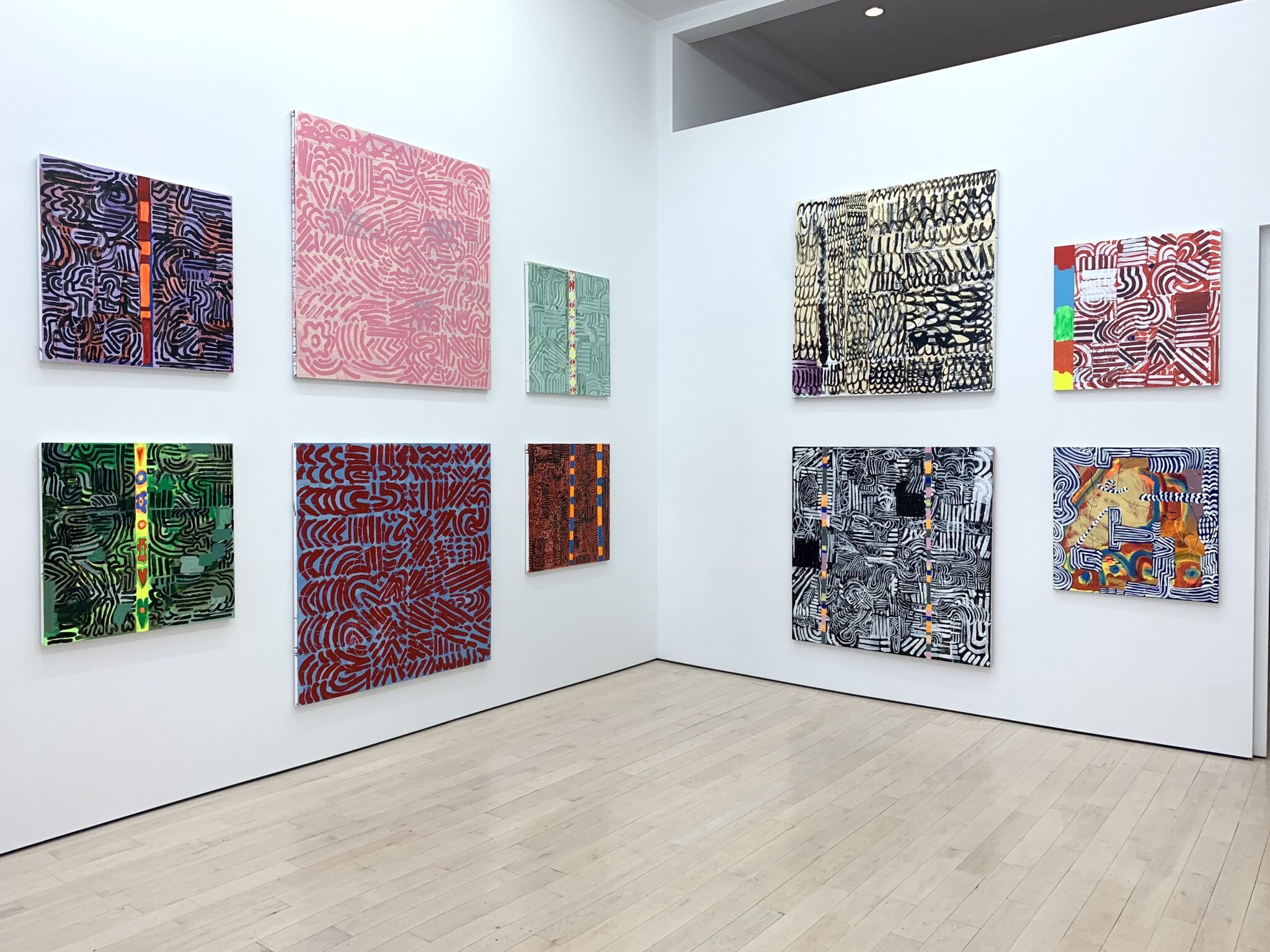
For her new paintings, on display at The Journal Gallery in their rotating “Tennis Elbow” series, Pam Glick seems to embrace both the automatic and the procedural.
Pam Glick, installation view

Pam Glick, installation view
Originally Published by Two Coats of Paint
Contributed by Jason Andrew
Artists often have generative strategies for jumpstarting a work. The AbExers’ had their automatism and the minimalists had their procedural arrangements. For her new paintings, on display at The Journal Gallery in their rotating “Tennis Elbow” series, Pam Glick seems to embrace both the automatic and the procedural.
I’m a huge fan of the sci-fi action film The Matrix. When Keanu Reeves’ character Neo begins to intuitively translate the binary numeric system cascading down a post-apocalyptic computer screen, the film gains momentum. Staring intensely at Glick’s paintings I found a way into her work—by thinking about code theory.
Glick has been celebrated for her “improvisational flair,” and for many years her paintings have been compositionally based on a matrix. Densely painted, the new paintings incorporate painted marks that are sectioned into rows that generate linear combinations. Through multiple works, there is a single band of painted information uniquely chroma-keyed to the surrounding fields. This single vertical row space serves as a generator-matrix, driving the narrative of a given painting towards a final resolution. As in The Matrix, these bands seem to reference the “real world” as distinct from a controlled and regulated one – privileged moments of consciousness within Glick’s matrix.
Curation: Appalachia Now! An Interdisciplinary Survey of Contemporary Art in Southern Appalachia
The inaugural exhibition of the newly renovated Museum. The exhibition provides a regional snapshot of the art of our time—a collective survey of contemporary Southern Appalachian culture.

Glenis Redmon
Location:
Abbleby Foundation Exhibition Hall, Explore Asheville Exhibition Hall
Dates:
November 14, 2019–February 3, 2020
Appalachia Now! An Interdisciplinary Survey of Contemporary Art in Southern Appalachia is the inaugural exhibition of the newly renovated Museum. The exhibition provides a regional snapshot of the art of our time—a collective survey of contemporary Southern Appalachian culture. This exhibition explores the amalgamation of tradition and present-day perspectives extant in contemporary artistic representations of life in this region. Appalachia Now! situates artists within a regional and national dialogue that spans time and socioeconomic status. Whether works are bio-bibliographical, or address larger, universal themes, this cross-disciplinary exhibition invites visitors to participate in the individual experiences that make this part of the world so unique. It celebrates contemporary artists living and working in Southern Appalachia, focusing on Asheville as a nucleus of creativity within the broader area of its adjacent states of Georgia, South Carolina, Tennessee, and Virginia.
Appalachia Now! builds upon the Museum’s mission of collecting and interpreting 20th- and 21st-century American art in all media relevant to/produced in the Southeast and WNC. Inclusive and ambitious in scope, the exhibition presents a survey of works by emerging and established artists selected by Jason Andrew, a curator and juror of national renown. Andrew and Lola Clairmont, former Museum curatorial assistant, drove over 40 hours around the Southeast and made 54 studio visits with artists. In order to promote under-recognized and emerging artists, Appalachia Now! features artists whose work is not yet represented in the Museum’s Collection.
The following 50 artists were selected through recommendations from regional museums, curators, and art organizations and through an open submission process. The overwhelming regional interest in this exhibition was demonstrated in the participation of artists in the free, public open call; over 400 artists applied through the call. Overall, the Museum and Andrew researched over 700 artists for consideration in the exhibition. The selected artists represent all media, including painting, sculpture, new media, dance, and film.

Curation: Groundings—dialogues between contemporary and historic members of AAA
Groundings examines the continuing legacy of American Abstract Artists by juxtaposing the works of historic and contemporary members of the organization. This online exhibition is the first of its kind for the group. Groundings is the initial installment in a series of three online shows, each developed by a different guest curator.
Location:
(Online) American Abstract Artists
Groundings—dialogues between contemporary and historic members of American Abstract Artists
Curated by Jason Andrew
Featuring works by:
Alice Adams, Suzy Frelinghuysen, Iona Kleinhaut, Katinka Mann, Nancy Manter, Betty Parsons, Judith Rothschild, Edith Schloss, Esphyr Slobodkina, & Karen Schifano
Groundings examines the continuing legacy of American Abstract Artists by juxtaposing the works of historic and contemporary members of the organization. Having little abstract tradition of their own, American artists, many of them immigrants to this country, formed this group in New York in 1936 at a time when abstract art was met with strong, even critical resistance. Through this group, one of the earliest to be particularly inclusive of women artists, a new advocacy emerged providing opportunities to exhibit and a much-needed refuge for discussion related to new ideas and artistic theories.
Originators of this group channeled a Cubist-based tradition of cool structural abstraction in the face of prevailing Social Realism and later held strong to this aesthetic during the dawn of the emotive and brutish school of Abstract Expressionism. Today, the group continues to expand in numbers and varying aesthetics.
This online exhibition, the first of its kind for the organization, brings together the work of ten women artists, five of whom are historic members and five of whom are contemporary members. Through the pairing of these artists, it is my intention to find aesthetic commonalities and compositional similarities that bridge decades of thinking and making. Throughout history, whether it be ancient, modern, or contemporary, art circulates a rhythm of evolution—one generation building upon the groundings of the former.
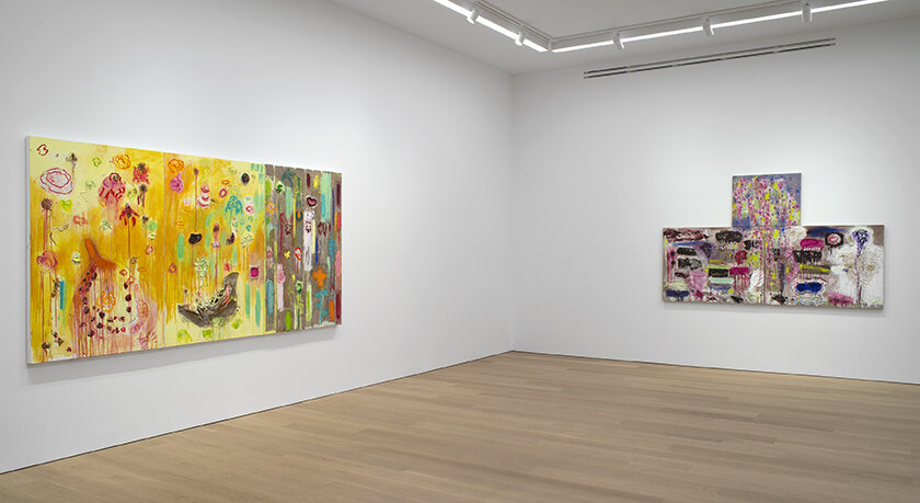
Joan Snyder: Painting from the inside out
In a 1976 Cincinnati Enquirer review of Joan Snyder’s paintings, the reviewer, Owen Findsen, surmised that she had “picked up a little of this, a little of that … and made it all uglier.”

Joan Snyder, installation view. Left: Ode to Summer (2019); Right: Weeping Cherry Tree & Thee (2020) / Courtesy CANADA
Contributed by Jason Andrew
In a 1976 Cincinnati Enquirer review of Joan Snyder’s paintings, the reviewer, Owen Findsen, surmised that she had “picked up a little of this, a little of that … and made it all uglier.” While he found her work offensive, even questioning it’s validity, for those like me who have come to love Snyder’s work, it couldn’t be a bigger compliment. Joan Snyder paints her world from the inside out.
Unabashedly expressive, her paintings are born of sorrow and moods, loss and struggles, and yes, peace and love as well. The new paintings now on view at CANADA echo a familiar cantata – an unapologetic narrative. “They are a form of keeping time,” Helen Molesworth writes in her witty catalogue essay accompanying the exhibition, “of remaining present, of acting as both observer and recorder.” The catalogue also features commentary by Wallace Whitney and Sean Scully.
Consistent throughout her work since the 1960s is Snyder’s use of a “stroke” – a heavy gesture succinctly pulled horizontally. Conceived as an alternative to the Great God Grid, this mark can be interpreted as a cancellation, a kind of crossing out. At first, at least, it was distinctly her own. Each stroke works in tandem with saturated orbs, scribbles, and textured elements of collage. While overtly physical, her paintings, often multi-paneled, are not lost to the oblivion of expression.
Snyder has always been outspoken, and her paintings are a kind of glorious outrage. When asked by Ruth Iskin, Lucy Lippard, and Arlene Raven to describe her art and its relationship to Feminism in 1977, she responded with an associative fusillade:
layers, words, membranes, cotton, cloth, rope, repetition, bodies, wet, opening, closing repetition, lists, life stories, grids, destroying grids, houses, intimacy, doorways, breasts, vaginas, flow, strong, building, putting together many disparaging elements, repetition, red, pink, black, earth feel colors, the sun, the moon…
The exhibition features a return to a common theme for Snyder, that of her “Field Series.” These works, painted in her studios in Woodstock and Brooklyn, continue to be about the sacred, the serene, fields of moons, moons in mud, rippling ponds, landscapes stretched out, and daily diaries exposed. These lush visions tell powerful stories.

The objectness of Rachael Gorchov
There is a long history of artists expanding the objectness – that is, the sculptural dimension – of painting. Picasso and Braque introduced this concept in their assemblage works; Vladimir Tatlin broadened it in his “counter-reliefs” alongside Elsa von Freytag-Loringhoventhe, the “Dada Baroness”.

Installation view: Rachael Gorchov’s exhibition “Concavity” at Owen James Gallery. Photo: Jason Andrew
Published in Two Coats of Paint
by Jason Andrew
There is a long history of artists expanding the objectness – that is, the sculptural dimension – of painting. Picasso and Braque introduced this concept in their assemblage works; Vladimir Tatlin broadened it in his “counter-reliefs” alongside Elsa von Freytag-Loringhoventhe, the “Dada Baroness”. For the Dadaists, breaking the picture plane meant breaking tradition, embracing chaos, and rejecting logic.
Decades later, as hardcore ideologies dissipated, Robert Rauschenberg, Bruce Conner, Elizabeth Murray, and many others explored the plasticity of painting in more playful and less doctrinaire ways. In her recent work, Rachael Gorchov revisits old ideologies but with an eye to establishing a new framework for painting. Gorchov is clearly interested in the traditional concerns of color, gesture, and pictorial space. And much like her cousin twice removed, the painter Ron Gorchov – whom she only met in adulthood – Rachael has developed a distinct structure for her work.
Although she was already working in ceramic around 2010, I first encountered her concave paintings (made through a combination of mixed-media including papier-mâché and clay) in a solo show she called “Convex Chromascope” at Hunter College in 2015. Her 2017 solo at Owen James (then in Greenpoint) represented a turning point in her work, as brushstroke and shape coalesced into a uniquely warped mise en scène.
Gorchov has incorporated vinyl printing (high-quality scans of paintings on paper) into her compositions. Mimicking a drop shadow as it cascades from a physical sculpture, the vinyl extends the work’s visual space and drama, confirming its strictly physical flatness while introducing the illusion of motion – just as the sun passing overhead designates time. Jennifer Bartlett’s paintings of the late 1980s incorporated sculptural elements that similarly extended their narrative. Although Gorchov’s work is much smaller in scale, her strategy is just as ambitious as Bartlett’s. And much like Bartlett’s sculptural features, Gorchov’s vinyl is a sardonic reminder of modern painting’s literalness.
Gorchov’s recent exhibition at Owen James Gallery (now located on Wooster Street in Soho), opened on the cusp of the COVID-19 outbreak, and I saw the show just days before it closed in early August. It featured nine wall-mounted works and two works installed on the floor. Gorchov now describes her work as “sculptural painting.”

On the road: "Take Five" in Buffalo
It seems only fitting that University at Buffalo, an institution built on the reputation of one of the great female art dealers of the 20th century, Martha Jackson, would be the one to raise the bar that much higher when it comes to “women’s work.”

Installation view Take Five at UB Anderson Gallery: L to R: Adriane Colburn, Melissa Dadourian, and Meghan Brady. Courtesy of the artists / Photo: Jason Andrew
Contributed by Jason Andrew
It seems only fitting that University at Buffalo, an institution built on the reputation of one of the great female art dealers of the 20th century, Martha Jackson, would be the one to raise the bar that much higher when it comes to “women’s work.” “Take Five” featured the work of five women: Meghan Brady, Adriane Colburn, Melissa Dadourian, Tricia Keightley, and Meg Lipke. Curated by Robert Scalise, the mercurial director at the UB Art Galleries, the show was one of the most ambitious and provocative exhibitions I saw in 2019 thanks to his dynamic eye and insightful juxtapositions. So with deadlines erased by the pandemic, I welcomed the opportunity to revisit an event that allowed each artist to take great risks in scale, break boundaries between genres in their processes, and push the notion of material as subject matter in their art.
Over the last few years, Meghan Brady has shifted away from painting on stretched canvas and towards site-specific unstretched works often on Tyvek. I first saw her work in April 2018 atTiger Strikes Asteroid. At the Anderson Gallery, her 16-foot, multi-paneled, blue beauty titled Everyday (2018) was a stunner. With big gestural marks and bold colors, she expands traditional pictorial space pushing painting into the realm of installation. It’s no wonder Brady’s work has been compared to Betty Woodman’s. Brady is brilliant in her ability to render breadth and drama in epic scale while puzzling in representational forms that allude to the human body and objects from the everyday.

Pat Passlof: At the apex of a leap
Before the painter Pat Passlof, who died in 2011, would allow me to visit her in her Forsyth Street studio, she insisted that I join her and her Tai chi class held in the park across the street.

Pat Passlof, Hawthorne, 1999, oil on linen, 87 x 75 inches
Contributed by Jason Andrew
Before the painter Pat Passlof, who died in 2011, would allow me to visit her in her Forsyth Street studio, she insisted that I join her and her Tai chi class held in the park across the street. “Sounds just like my sister!” exclaimed Aileen Passloff (Pat dropped the second “f” early in her career after discovering when signing a painting that she didn’t leave enough room for two), the noted dancer, choreographer and Bard College professor. “She was fiercely demanding about art and about everything else, really.”
It was exciting that the first painting I encountered at her current survey at the Milton Resnick and Pat Passlof Foundation was the very same one that Pat had set aside for a show I curated. Titled Hawthorne and made in 1999, it is a stunning example of her distinctive talent. It’s well-chronicled that she studied with Willem de Kooning and was married to Resnick, and parallels are certainly decipherable in this exhibition. But it was Pat who straddled the canvas and directed the brush. While she was deeply connected to those figures, she was also a frimly independent artist. At last it’s exciting to see a major survey all within an institution that Pat built.
Curated by the venerable Karen Wilkin, the show fills three floors of Foundation. On each floor there is a non-chronological hang mixing the decades and revealing the diverse directions of Passlof’s nearly eighty-year career. For instance, on the first floor, fifty years separate one of the earliest works on view, Gulf (1949) from Hawthorne (1999). For those unfamiliar with Passlof’s work, this discontinuous approach to a survey could prove disorienting, even jarring. I found it liberating. The strategy does require patience. But, as Passlof said, “Painting is inconvenient. It is slow and may require a whole life.”
On the second floor, an untitled painting from 1995 greets us at the top of the stairs. It’s colorful, depicting a period when Passlof recorded dreams and explored myths. The painting features two horses with riders and one lone horse within a gestural landscape built up from bottom to top with painterly yellows, greens, and blues. A bright orange cloud reflects a setting sun. Aileen recently told me that before their father married, he was an officer in the mounted police. “My father rode six horses at once. He could pickup a handkerchief with his teeth – the horses all along galloping.” Aileen didn’t take to riding as Pat did. Perhaps Pat was teasing out an autobiographical lament: she rides with their father and Aileen’s horse waits for her to climb on.

Studio Visit (at last) with Lucy Mink
Lucy Mink was the first artist I came to know solely through Facebook. She didn’t live in Brooklyn but in rural Contoocook, New Hampshire, and I became cyber-obsessed, waiting for each new post from her studio.
Lucy Mink, cushion, 2019, oil on linen, 48 x 54 inches. Image courtesy of the artist
Contributed by Jason Andrew
Lucy Mink was the first artist I came to know solely through Facebook. She didn’t live in Brooklyn but in rural Contoocook, New Hampshire, and I became cyber-obsessed, waiting for each new post from her studio. What I saw then and continue to see today in Mink’s work is an embrace of the kind of American modernism established by artists including, notably, Arthur Dove and Georgia O’Keeffe. Mink’s paintings, like Dove’s, reflect a desire to capture “the play, or swing of space” as felt through a tapping of the unconsciousness. And, as I’ve written about O’Keeffe’s work, Mink’s is assertive in its composition and deliberate in its brushwork. This quality distinguished O’Keeffe and now makes Mink one of my favorite contemporary artists. Eventually I invited her to do a show at Outlet Fine Art, the gallery I once co-owned with John Silvis and Julian-Jimarez. It wasn’t until then, when she delivered the work and we installed the exhibition, that we finally met face-to-face.
Lucy’s studio is just an hour or so from the White Mountains. Anticipating the end of the summer and my return to Brooklyn from my house in Jay, New York, I sent her a DM on Instagram. She put a fishing trip with her kids on hold, and we arranged for me to stop and visit as I drove southeast. With the neighbor’s chickens darting underfoot, I stepped into her studio.
Jason Andrew: What has changed most in the work since our show together in 2015?
Lucy Mink: There are more lines, and as I still continue to draw with the paint, I see looser areas. In grad school I got really expressive and my marks changed. Maybe I want to go there again. I often check back in on what I did in the past, while adding what I have learned about paint. As I work it all depends on the day; today for instance I am being really careful with my edges. Other days I am not. I think things will continue to change as I get more room to leave stuff out (imagine expanding my studio to the upstairs of this house).
Some of it also relates to what is going on in the world, my head, the day. There are a lot more boxes and closed-in spaces in the paintings I’m working on now. Some have many thin layers, whereas others, like the ones I showed at Outlet, have a lighter feel. Also the work I showed in Brooklyn had a lot of movement. I’ve also been limiting my palette, which is something I seem to do every now and then to get myself to go somewhere else, but also as a way to get the most out of, let’s say, a certain green or a red, and how the two interact. When I think back to when I painted vacation and then went on to paint other big ones after that, I remember how great it was to be making those paintings. I like painting them more than I like them when they are done. Last year was like that, too. Prior to the residency I had the bigger paintings going along with the small ones in my studio, and there was this day, I must have had the news on, and I remember titling a painting 2038 because I just wanted to skip ahead and hope things could be better. Now, for the most part, I listen to music in my studio and the car, and I read the news.

Ruth Root: Syntax for a jangled world
In an exhibition of ten new paintings at the Carnegie Museum in Pittsburgh, Ruth Root extends her definition of the medium and her own personal language.

Installation Image: Ruth Root at Carnegie Museum, Pittsburgh. Courtesy the artist and Andrew Kreps Gallery, New York. (Photos by the author)
Contributed by Jason Andrew
In an exhibition of ten new paintings at the Carnegie Museum in Pittsburgh, Ruth Root extends her definition of the medium and her own personal language. Since the late 1990s, through a variety of “painting” materials, Root has charted an independent course through a Formalist-sanctioned medium, often rigidly classified by shape, color, and space. She is among the best pictorial pathfinders working today.
A self-proclaimed appreciator of both historical and contemporary painting, Root’s work lives in a poem-ic space reminiscent of Cubism’s architecture and Minimalism’s polemical landscape. “The paintings are almost like flattened sculptures that I have turned into paintings,” Root explained in an interview in 2015 during the occasion of her survey at the Aldrich Museum.
The new batch of paintings, all untitled and dated 2019, features a broadly explored theme of inversion and contrast. For example, two paintings are identically shaped and mirror each other. Even though this compositional strategy seems simple, Root has is able to distinguish the paintings with mark and color so that the phrasing of each is completely unique—variations on a theme of variations.

In a Biting Letter to Basquiat in 1981, Edith Schloss Dragged the NYC Art Scene
Read this 3,700-word, hyper-critical letter discussing the work of Philip Guston, Anselm Kiefer, Nell Blaine, Bill King, Arthur Dove, Marsden Hartley, and several others: "Everyone seems to be proud of having no go, no oomph."
Edith Schloss in Pietrasanta, © The Estate of Edith Schloss (courtesy Artist Estate Studio)
In May 1981, painter Edith Schloss, who was a staff critic at the International Herald Tribune, published a review of the exhibition New York / New Wave at P.S. 1 (currently MoMA PS1). The review was the first mention ever of a rising young artist Jean-Michel Basquiat. Later that decade, Schloss penned a letter to Basquiat. She confesses her love for his work and offers him advice. And in a rambling, hyper-critical critique of the art scene in New York, she discusses the work of Philip Guston, Anselm Kiefer, Nell Blaine, Bill King, Arthur Dove, Marsden Hartley, Kenny Scharf, Susan Rothenberg, Eric Fischl, Donald Baechler, Jennifer Bartlett, Elizabeth Murray, Francesco Clemente, and others, as well as galleries, including Exit Art, Anina Nosei, and the East Village. This is that letter.
Letter to Jean-Michel Before It’s Too Late, or New York Art Now
When I saw your first work at P.S. 1 in 1981, I did something bad: on the bricks next to your drawings on typewriter paper I wrote with pencil: “I love these.”
Later, when I called up for more particulars, your manager, and the manager of the whole P.S.1 show, offered me your drawings for one hundred dollars each. But I said I was in the art selling business, not in the art buying business, and in this way I added another item to the long list of lost opportunities in my life. But je ne regrette rien, as my namesake sang.
Before I go any further, dear Jean-Michel, I must explain that I’m a painter, but as a hobby I write art reviews, and once I lived in New York and now I live in Europe.
Then I saw your big scrawly wiry things at the Whitney Biennial 1983.

Yevgeniya Baras: Impastoed strata
Spend anytime out in the rural West, particularly the plains of southwest Texas, and you’ll discover the daunting challenge of repelling dust and dirt. At some point, you just have to accept a little discomfort as a small cost of the region’s wondrous horizons, desert winds, and moonlit nights.

Yevgeniya Baras, installation view (Photo by Jason Andrew)
Contributed by Jason Andrew
Spend anytime out in the rural West, particularly the plains of southwest Texas, and you’ll discover the daunting challenge of repelling dust and dirt. At some point, you just have to accept a little discomfort as a small cost of the region’s wondrous horizons, desert winds, and moonlit nights. Returning from a coveted residency at the Chinati Foundation in Marfa, Texas, painter Yevgeniya Baras incurred that cost and returned with a lighter palette and a renewed sensitivity to form in her new process-oriented paintings, on view in “Seam, Scar, Sign” at Nicelle Beauchene through May 26.
I came to know Yevgeniya and her work in the trenches of Bushwick circa 2010. She and a lovely group of artists founded Regina Rex around that time, and I included her work in a 2011 exhibition at my gallery Storefront, then on Wilson Avenue. Muddy, dark, and moody with thick impastoed surfaces and a synthesis of diverse subjects that allude to modern psychoanalytic theory, these paintings drew me in.
While the new set of paintings move beyond their mysterious predecessors, they remain deep image painting– a concept I derived from the unexpected juxtapositions and surrealist leaps made by poets of the 1960s. It’s well suited to Yevgeniya, whose raw imagery conjures a world that floats between the real and the dream and inspires symbolism and mysticism.
Eleven paintings, all made in the last two years and all untitled, make up the exhibition. While the works are easel-sized, existentially they scan way bigger. Acutely attuned to the human condition and imagining the canvas as an extension of the body, Yevgeniya has continued to layer her surface (often heavy burlap) with impastoed oil paint, rocks, bits of wood, and paper pulp. Though she remains alert to darkness, optimism prevails in the new work by way of frothier, fresher, and looser composition. Dusty pinks, lighter blues, and even patches of white have fostered a new approachability.

Nancy Graves: Sorting the cosmic haze
In 1959, British scientist and novelist C.P. Snow, struck by the inability of intellectuals and scientists to communicate and thereby to make sense of and tame nuclear weapons, delivered a lecture at Cambridge arguing that the divide between the sciences and the humanities was intensifying world’s problems.

Nancy Graves, Mars (1973), detail, acrylic on canvas, 4 panels, overall: 96 x 288 inches. unless otherwise noted, images are courtesy of the Nancy Graves Foundation via Mitchell-Innes & Nash, New York
Contributed by Jason Andrew
In 1959, British scientist and novelist C.P. Snow, struck by the inability of intellectuals and scientists to communicate and thereby to make sense of and tame nuclear weapons, delivered a lecture at Cambridge arguing that the divide between the sciences and the humanities was intensifying world’s problems. Two Cultures and the Scientific Revolution, the book encapsulating his ideas, became one of strongest post-World War II influences on Western public discourse. Nancy Graves (1939–95), whose paintings and works on paper are now on display at Mitchell-Innes & Nash, took Snow’s ideas to heart by creating art that was at once aesthetically challenging and intellectually probing – the humanities and the sciences all rolled into one. The root of her inspiration, however, was endearingly humble: “I was born and raised in Pittsfield, Mass., where my father worked as a guard in the Berkshire Museum of Art and Natural History,” Graves told the New York Times in January 1979. “In that way I came to think of art and natural history as one.”
Although unknown to many, Graves was a key figure of postwar art, working prolifically in sculpture, painting, printmaking, and film. She is most celebrated for her life-size fur-covered Mongolian Bactrian camels and variations on that theme that included installations of their bones. Their ambitious presentation as sculpture had the art world intelligentsia on both sides of the continent scratching their heads. “This is the most subversive thing that has happened to art since the early modernists abolished the subject altogether,” wrote Alfred Frankenstein in the San Francisco Sunday Examiner and Chronicle in April 1969. Writing for theNew York Times in December 1971, Peter Schjeldahl was “hard put to decide which was more preposterous, the object itself or the theory that was to make the object comprehensible.”
Explaining the far-out radicalism of this particular work, Graves said that “the psychological experience of confrontation with the camel is the occasion to think about the nature of experience.” Graves was claiming the natural world as a topic of artistic interest. If a pile of Brillo boxes could be called art, why not a room full of fabricated camels? She concerned herself not only with nature but also with the technological advances that challenged and sometimes threatened it: Sputnik, lunar exploration, moon landings, space probes, satellites, television, computers, and the nuclear arms race. Jackson Pollock’s observation that “new needs need new techniques” clearly rang true for her. In the early 1970s, 30 years into the Cold War and the postwar onslaught of technology, Graves gave sculpture a rest and focused on interpreting scientific developments in the intrepid work now on view in Chelsea.

Judy Pfaff: Busting pictures to hell
De Kooning once said, “Every so often a painter has to destroy painting.” Cezanne did it. Picasso did it. Then there was Pollock. As de Kooning put it, he “busted our idea of a picture to hell.”

Judy Pfaff, Quartet One, 2018; Photographic inspired digital image, wire frame, acrylic, melted plastic, aluminum discs, fungus, paper, glitter, Styrofoam, fluorescent light, drawing in artist’s frame; 120.75 x 156 x 32 inches.jpg
Contributed by Jason Andrew
De Kooning once said, “Every so often a painter has to destroy painting.” Cezanne did it. Picasso did it. Then there was Pollock. As de Kooning put it, he “busted our idea of a picture to hell.” And after him came Judy Pfaff. Ever since her three-wall breakout show in the backroom of Artists Space in 1974, she has been at odds with the stringent attitudes and moral fervor that burdened postwar painting. In a suite of four new wall-sized works at Miles McEnery Gallery, Pfaff draws inspiration from a lifelong interest in the natural and the spiritual realms.
Straight out of Al Held’s classroom at Yale, Pfaff took a sculptural approach to painting. Strong color, bold three-dimensional accents, and a strong impulse towards architecture have been the currents driving her art. “I’m at war with conventions,” Pfaff said in an interview with Irving Sandler in 1982. Because her work escapes definition, her eclectic, freewheeling gestalt has been mistaken for artistic gesture linked to the Abstract Expressionists. But the visual opulence of her work is more appropriately described as a kind of global orchestration of ideas.
I’ve always thought that she was at her best when she fully embraced her unbridled effervescence and cast aside the conventional limits of an exhibition space (and the marketplace, for that matter), as she did in first installation of hers that I saw at the André Emmerich Gallery in 1997. When it’s uncanvassed and unbound, her work conveys a risk-courting adventurousness that is all the more compelling because it edges toward the ephemeral – like performance and indeed life itself. This disposition cuts sharply against the “objectness” of painting.

Jenny Snider: Mutiny, rebellion, the experience of life
Jenny Snider is a storyteller. The content and form of her art come from a variety of sources: history, popular culture, politics, and art itself in the form of grid-based abstraction representing natural and mechanical forms.

Jenny Snider, Noir, 1995, oil on canvas board, 20 x 24 inches
Contributed by Jason Andrew
Jenny Snider is a storyteller. The content and form of her art come from a variety of sources: history, popular culture, politics, and art itself in the form of grid-based abstraction representing natural and mechanical forms. But singularly, she is interested in “describing the experience of the life I know and imagine, all melding with the books I’ve read, the movies I’ve seen, the cars we drove, the views from my window.” A mini-survey of Snider’s work on view at Edward Thorp Gallery highlights the artist’s witty, gritty, and elusive career with selected works from the 1970s to the present.
Mutiny, rebellion, the downcast, and the outcast have been themes underlying Snider’s work. The earliest piece is from 1972 – a gridded ink drawing on rice paper titled Fuji. For Snider, much like her Yale classmate Jennifer Bartlett, the grid came to support an open construct. The recurrence of the grid for her is reflective of “conversations in consciousness raising groups, of being a woman and the struggle between domestic and professional.”
Snider cites personal experience in Master Class (1973), painted at a time when the artist was studying the 1887-1888 Shanghai Edition of The Mustard Seed Garden Manual of Painting, and when Picasso passed away. “Picasso died and there was a lengthy obit in The New York Times celebrating his big life,” Snider said. “I was so angry. His shadow cast over us all.” The beautifully rendered meditative studies she had been making gave way to an imposing bust portrait of one of the 20th century’s greatest misogynists. Beyond the portrait, and perhaps in an arch effort to outshine the master, Snider penned her own (hilarious) obituary that was later published in the satirical issue of Heresies edited by Martha Wilson.

Katherine Bradford: Deep image painting
The art of Katherine Bradford, on view at Canada through October 21, is deep image painting. Her often heroic imagery and surrealist leaps echo a floating world, one that narratively exists between the real and the dream. Each work has a self-conscious spiritualist language that represents a developing poetic stance – a story that starts, but never finishes its tale.

Katherine Bradford, Water Lady, 2018, acrylic on canvas, 80 x 68 inches
Contributed by Jason Andrew
The art of Katherine Bradford, on view at Canada through October 21, is deep image painting. Her often heroic imagery and surrealist leaps echo a floating world, one that narratively exists between the real and the dream. Each work has a self-conscious spiritualist language that represents a developing poetic stance – a story that starts, but never finishes its tale.
Take the painting Water Lady, a monolithic central figure with a glowing red rectangle on the chest, kneels in a pool of water. In a cross-body reach, the figure collects water as it pours from a bottle suspended in mid-air. It’s a dreamlike picture in which identity is represented not just by the faceless pink painted human form, but also by the collective symbolic setting. What’s most arresting about this picture, aside from the odd outstretched arms that occupy the bottom margin of the canvas, is that it situates us in the middle of the narrative and prompts us to ask, “How did we get here?” and “How will it end?” These questions are inherent in all of Bradford’s work.
The term deep image was coined in the early 1960s by American poets Jerome Rothenberg and Robert Kelly to describe their own writing style, which was characterized by a resonant and heroic tone, unexpected juxtapositions, and surrealist leaps. It was a style inspired as much by Charles Olson’s projectivism as by the cante jondo or deep song and the poetry of Federico García Lorca.
For Rothenberg, the deep image poem reflected two realities: first, the empirical world of the naïve realist of what we know; second, the hidden floating world of what is to be discovered. The first world both hides and leads into the second, which in turn as a lure and a repository of dreams. For Rothenberg, deep work is perception and vision, and the poem is the movement between them. For Bradford, paint is instead the vehicle.
At 76, Bradford’s personal and empathic style of figurative abstraction dives deep into human psyche. Over the years she has introduced themes that range from Superman and swimmers to Titanic-like ocean liners. As a master mark-maker with a five-inch brush, her work has been placed in the broad context of Abstract Expressionism. I think it pleases Bradford that we can approach her work from an abstract point of view, but the very complex and deeply psychological pictures tell us more influences are afoot.
Bradford may be a more direct artistic descendant of the late, great Elizabeth Murray, who famously brought subject matter back into abstraction. Bradford also channels Joan Brown, whose work conveyed a kind of ipso facto feminism. And Bradford borrows the poetic excess found in the paintings by Alice Neel. In all cases, Bradford has learned from the best, composed on her own, and developed an impeccable instinct.