
Resources
ABOUT US / SERVICES / OUR CLIENTS / STORE / CONTACT
Review: Edith Schloss: Blue Italian Skies Above
What a wonderful time to discover the sly and seductive charm of Edith Schloss's largely under-the-radar art, writing, and life.

Installation view, Edith Schloss: Blue Italian Skies Above, at Alexandre Gallery, April 30 - June 11.
What a wonderful time to discover the sly and seductive charm of Edith Schloss’s largely under-the-radar art, writing, and life. All of it is so apt, entertaining, and informative that it’s impossible to decide what should be quoted for insight or fun. For example, the novelist Jane Bowles sets the stage, speaking from the Chelsea loft on 21st Street that Schloss shared with her husband of 13 years photographer Rudy Burkhardt:
I know that everyone here has slept at one time or another with someone or another in this loft. We stared at one another, old lovers new husbands, this one having lived with that, secretly or not, summer or winter, in rain or shine—Bill Elaine, Edwin, Fairfield, Anne and Anne, Jean, Ruth, Pit, Larry, Milton, Alex, tess, Walter, Paul, Fritz, Nell, Ilse, Marisol, Bob, Jimmy, Jane, Joe, Rudy, and me. It was uncanny. It was true. Everyone was there.
The German-born artist, who died in 2011, documented off-handedly her life as a refuge first in New York, in 1942, and then Rome in 1962, in an insightful posthumous memoir Loft Generation: from de Kooning to Twombly Portraits and Sketches 1942–2011.
Schloss also left us with an ebullient body of warm and eccentric paintings created in the 1960s and ’70s on the island of Spezia that were recently on view at Alexandre Gallery’s new fresh-white downtown space. In these, the objects are the characters sharply profiled—the little boats, beach balls, a lone bird, a bowl of fruit, close ups of primary-colored lollypop-like flowers pose head on. The painting Spring Green (1967) poignantly features two Gustonesque figures as objects, one with baby, stretched out flat on the grass.
Jack Tworkov: Towards Nirvana / Works from the 70s
The eight paintings and seven drawings that comprise Towards Nirvana/ Works from the 70s all date from an important decade for Jack Tworkov (1900–1982).
The eight paintings and seven drawings that comprise Towards Nirvana/ Works from the 70s all date from an important decade for Jack Tworkov (1900–1982). The 1970s saw a solo show at the Whitney Museum curated by Marcia Tucker (1971), the Skowhegan Medal for Painting (1974) (presented to the artist by artist and dealer Betty Parsons), and a career survey at the Third Eye Centre, Glasgow (1979) which toured the UK. Significantly, Tworkov had undertaken changes to his painting, moving away from the more obviously gestural spontaneity that marked his development in Abstract Expressionism in New York. Trial and error evolved into a meditative, analytical approach for which Tworkov also developed a new medium of oil pigment mixed with Lucite (a synthetic organic compound) thinned with turpentine. This method emphasized the quality, particularity, and viscosity of his brush mark—a mark he would eventually set over a mathematically calculated pencil grid. The mark as a discreet, repeated element remained a constant focus throughout Twrorkov’s long career.
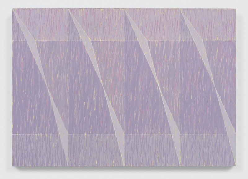
Jack Tworkov, OP-Q2-77-3.5.8 Series, 1977. Oil on paper, 18 x 18 inches. Courtesy the Jack Tworkov Estate and Van Doren Waxter. © 2021 Estate of Jack Tworkov / Artists Rights Society (ARS), NY.
In his essay, “On My Outlook as a Painter: A Memoir” (1974), originally published in Leonardo: International Journal of the Contemporary Artist, Tworkov spoke of a “ruling middle-class… [that] now preens itself as the patron and advocate of every outrage-as-innovation. It has coopted bohemia and captured its style and established it as typically bourgeois.” He continued, bemoaning “the vulgarization of life and politics for which the same class is to be held responsible.” The turn away from a devalued, expressionist abstraction towards an austere, conceptual, and rigorous painting, though no less sensual, reflected Tworkov’s observations on and experiences of the wider world—not simply his formal innovation.
Idling II (1970) is a vertical painting, with a black margin abutting the sides of a descending sequence of varying grey brush marks. The paint runs as the narrow brush marks are applied with an even rhythm. The paint weaves and interlaces unpredictably between control and accident—open within measure, a freedom within chosen restraints. There is an aliveness to the marks made by the thinned paint after it leaves the brush and encounters gravity, moving sideways, creating angled curves, or more or less flowing directly downward. The field of modulated color is meditative, and full of incident, held between the dark vertical boundaries that enable the field to be concentrated, rather than expanded as an otherwise all-over monochrome might. The specificity of the painting qua painting is as unforced as it is intense.